Brand Experience Design for a Confectionery Brand — North American Market
Le Pont is a confectionery brand with a location in West Vancouver. For this project, I led the engagement from initial client discovery through concept development to web design, and also contributed to art and photo direction.
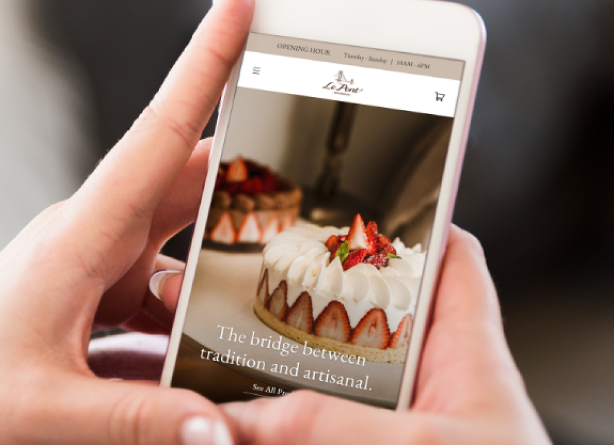
The central concept was to treat the sweets themselves as something jewel-like — precious, crafted objects — and to let that idea drive every design decision, creating an experience where the inherent beauty of each piece is the focal point.
As part of the broader branding work, I contributed to art and photo direction to ensure the concept translated beautifully into visual expression. Working in close collaboration with the developer, I helped deliver a high-quality website within a constrained budget.
Role
Duration
Team
Contribution
This project required thinking carefully about how to translate the brand's qualities — its delicacy, sense of craftsmanship, and quiet refinement — into a visual experience.
For a brand launching its first location, the website wasn't simply a place to present information. It was the first point of contact, the space where an initial impression would form. That meant legibility and usability had to coexist with something harder to define: the feeling that this is a brand with a distinct identity.
Working alongside the senior designer, I was primarily responsible for:
- Visual design of the website
- Layout decisions aligned with the brand tone
- Art direction support — shaping how photography was presented and how the brand world was built
- Design adjustments for implementation in close coordination with the developer
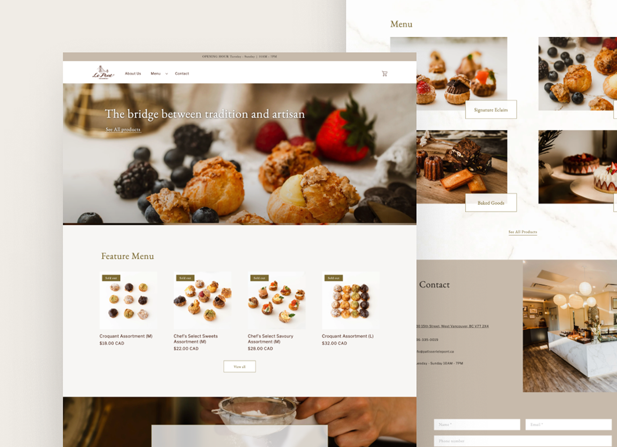
The guiding principle throughout was to present the sweets not as casual, everyday consumables, but as something of genuine quality — objects shaped by craft and the careful selection of ingredients.
To support this, the visual language leaned heavily on generous white space, allowing the texture and light in the photography to breathe. A restrained color palette and delicate typography worked together to give the brand a sense of quiet luxury.
In terms of photography, the goal was never simply to display products in a grid. Instead, I focused on conveying the texture of materials and the sense of hands at work — so that the brand's world could emerge naturally, even through a screen.

To ensure the brand experience remained consistent across all digital touchpoints, the following were designed as a unified system:
- Website
- Product visuals
- Photographic art direction
- Tonal design across all pages
Throughout, the priority was to hold two things in balance: a visual quality that genuinely evokes the brand's world, and a structure that allows users to access product and store information without friction.