UX Research, UI Design & Design System for a Sales Force Automation Tool
I joined this project as a UX/UI designer on the redesign of an SFA (Sales Force Automation) tool used by sales representatives during online business meetings.
One of the core challenges was that the product serves two distinct audiences simultaneously — the sales reps using the tool, and their clients on the other side of the meeting. Designing for this dual-audience context meant creating an experience that worked well for a wide range of users, including older adults, which made accessibility a central design consideration.
I conducted competitive research and user research to build a thorough understanding of the landscape, then used those insights to define a brand concept and work toward a product with a coherent, consistent brand identity. I also built an accessibility-first interface and design system aligned with WCAG guidelines, and led activities including typographic validation and a workshop on cognitive aspects of UI design for older users.
Role
Duration
Team
Contributions
Product Overview
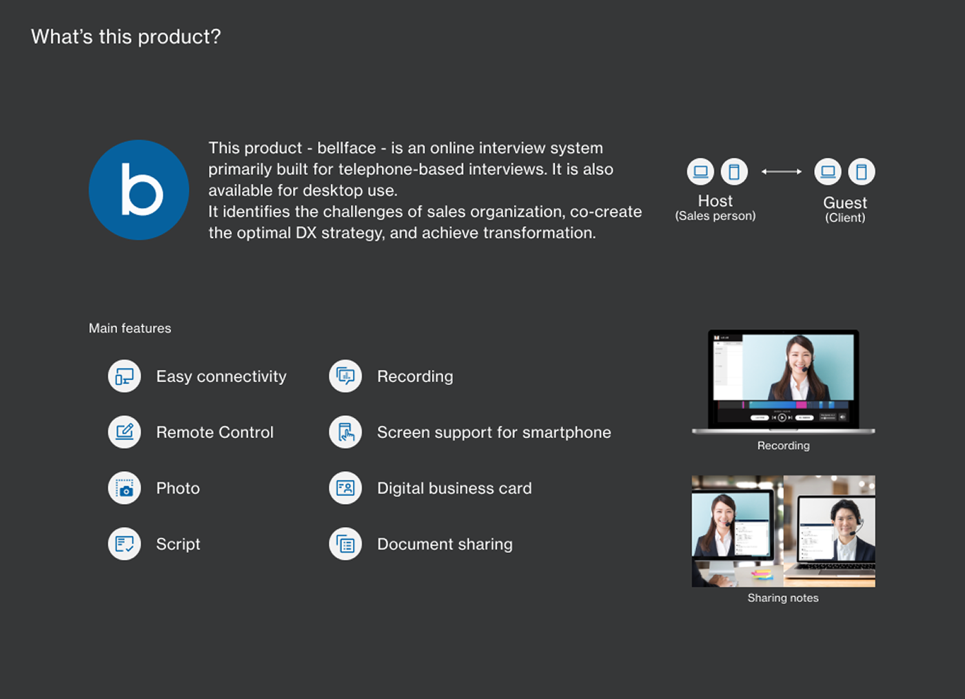
bellface is an SFA (Sales Force Automation) tool designed for sales representatives to use during online business meetings. Built around video calling as its core feature, the platform enables the entire sales process — from initial proposal through to contract signing — to be completed entirely online. Its particular strength lies in streamlining the complex contract workflows common in real estate transactions, making it well-suited for teams operating in that industry.
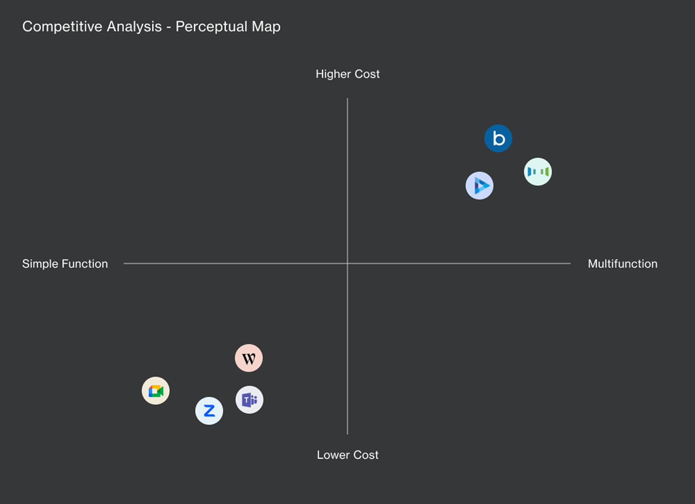
Competitive Analysis — Positioning Map
The core feature of any online meeting tool is video calling. I identified the tools most commonly used in this space, mapped their features and characteristics, and created a positioning map.
The analysis revealed that our product was positioned in the high-price, high-feature quadrant — and that several competing brands occupied a similar position in the market.
As a strategic response, the company decided to focus its differentiation efforts on acquiring clients in the real estate industry. Real estate negotiations involve a high degree of legal complexity around contracts, and completing those agreements entirely online presents real friction. The company's strategy was to build end-to-end online transaction capability — from initial proposal through to signed contract — as a clear point of differentiation from competitors.
Internal Analysis
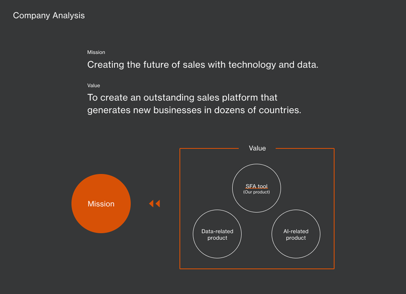
The company was developing multiple products in line with its mission and values, and this project was one of them. Guided by the company value of "building an outstanding sales platform," a central theme for this project was creating a product that sales representatives could genuinely rely on during online business meetings.
User Research
The diverse target audience that the business team had envisioned was synthesized into three core personas:
- Technical Support staff
- Real estate sales representatives
- Sales managers
Based on user interviews, I analyzed the insights and pain points specific to each group.
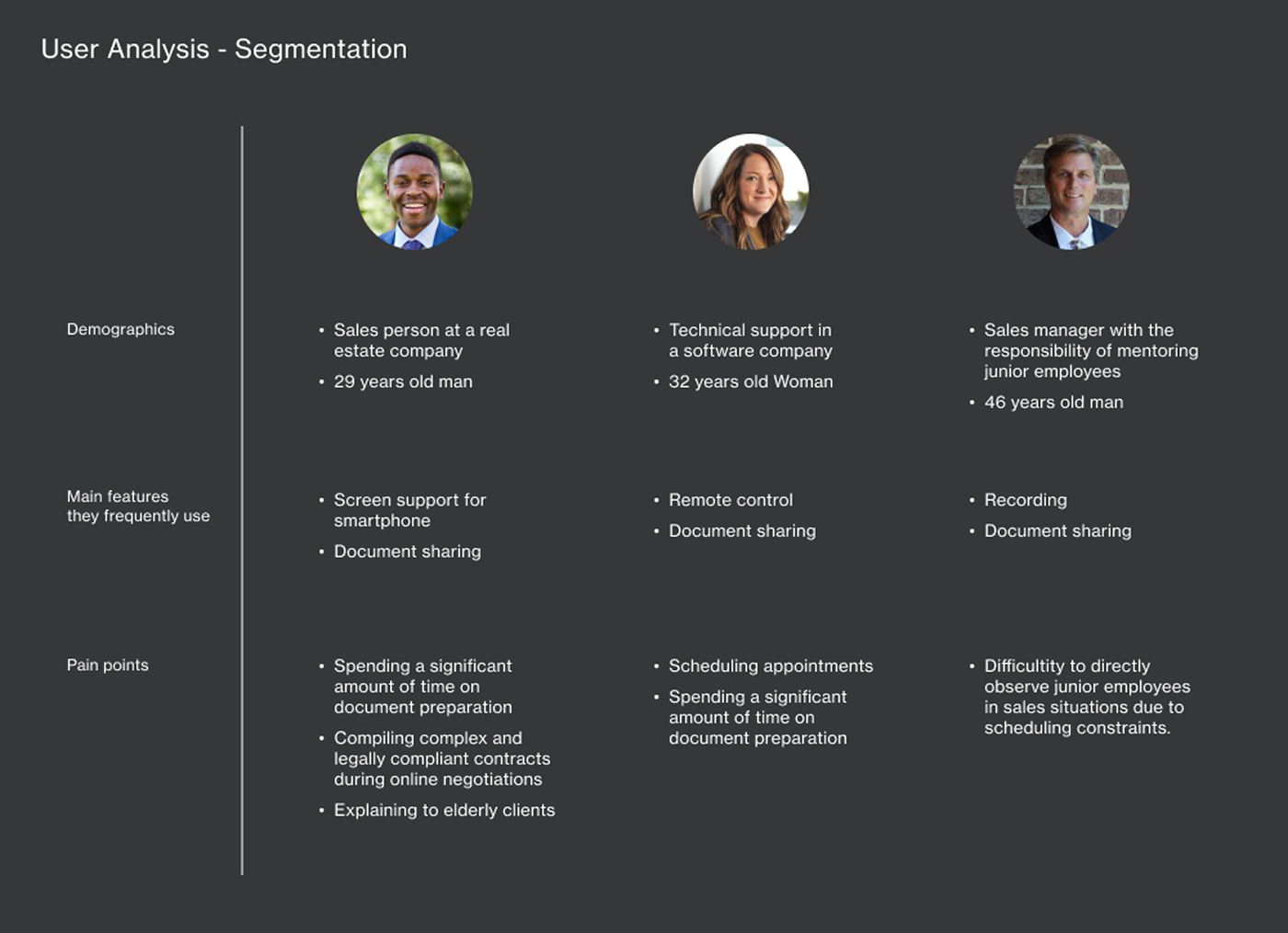
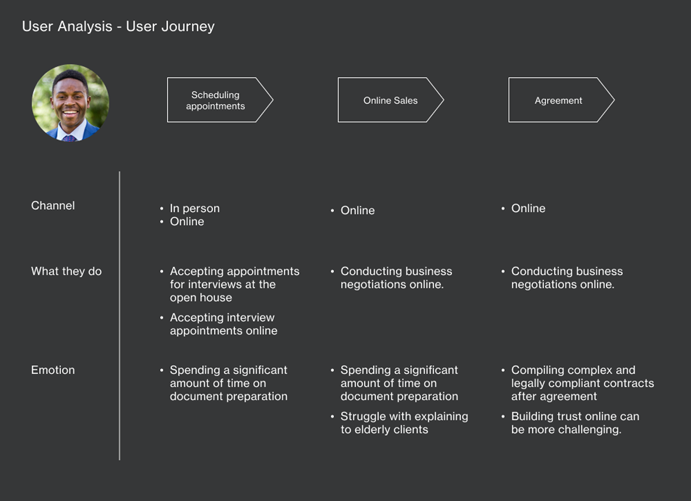
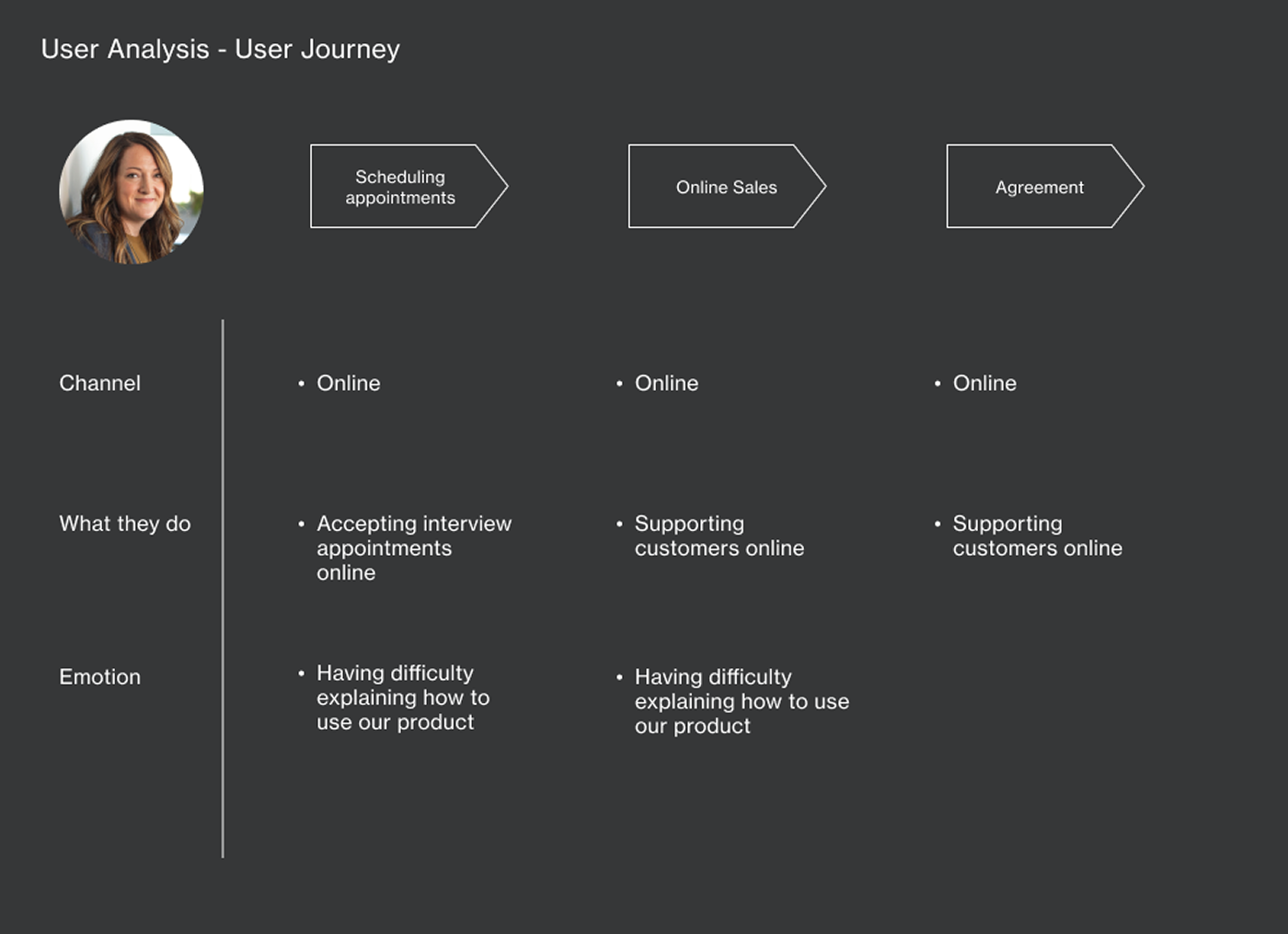
ⅰ. Real Estate Sales Representatives
Real estate negotiations involve significant regulatory complexity and multi-step processes around contracts. On top of that, building trust with clients is inherently more difficult in a remote setting. Clients in the real estate sector also tend to skew older, meaning that some users require more patient guidance on how to use the product.In response to these challenges, I explored a direction centered on supporting relationship-building through customer support features and document-sharing functionality — aiming for a state where clients feel confident and at ease throughout the experience.
ⅱ. Technical Support Staff
Technical support staff primarily use features like remote control and screen sharing to help customers resolve issues. These features can be complex to explain clearly to end users. Managing a high volume of support requests also made scheduling a recurring operational challenge.
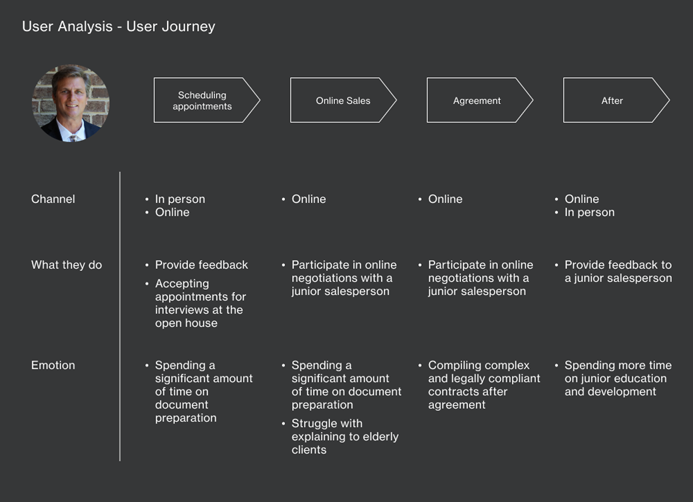
ⅲ. Sales Managers
In addition to managing their own deals, sales managers dedicate a significant portion of their time to mentoring junior team members. The goal was to help managers efficiently oversee their responsibilities by leveraging the meeting recording functionality.
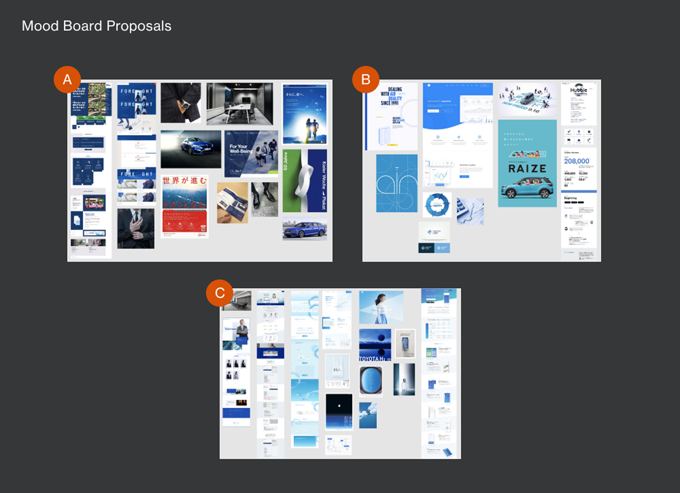
Moodboard Proposals
Three moodboard directions were developed as proposals:
- A — Professional and trustworthy; conveys expertise and reliability
- B — Technology-forward; a tech and IT aesthetic
- C — Human and approachable; fresh and personable
Design Direction
The final direction selected was Concept C.
The intent was to give the product a slightly humanized quality — to communicate the feeling of a reliable presence alongside the user. We believed that moving closer to becoming an industry standard would bring the product's mission to life most effectively.
As a reference point, I analyzed the advertising and design of well-known standard brands from other industries within Japan. The fact that several competitors had already adopted visual identities closer to Concept A also influenced the decision.
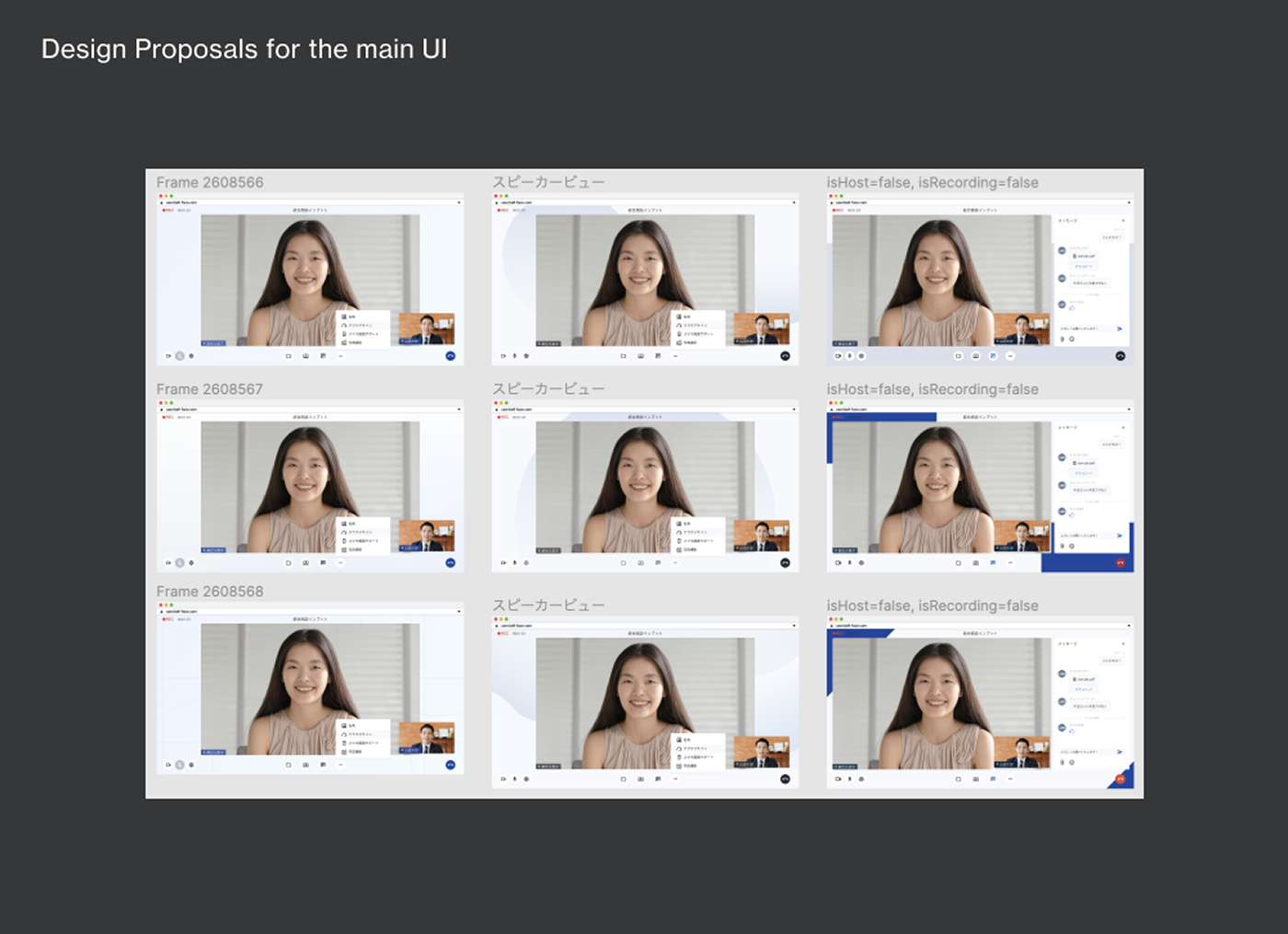
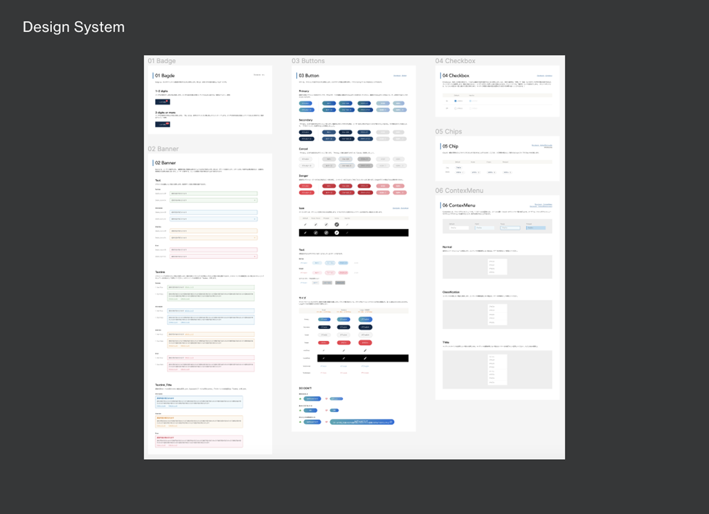
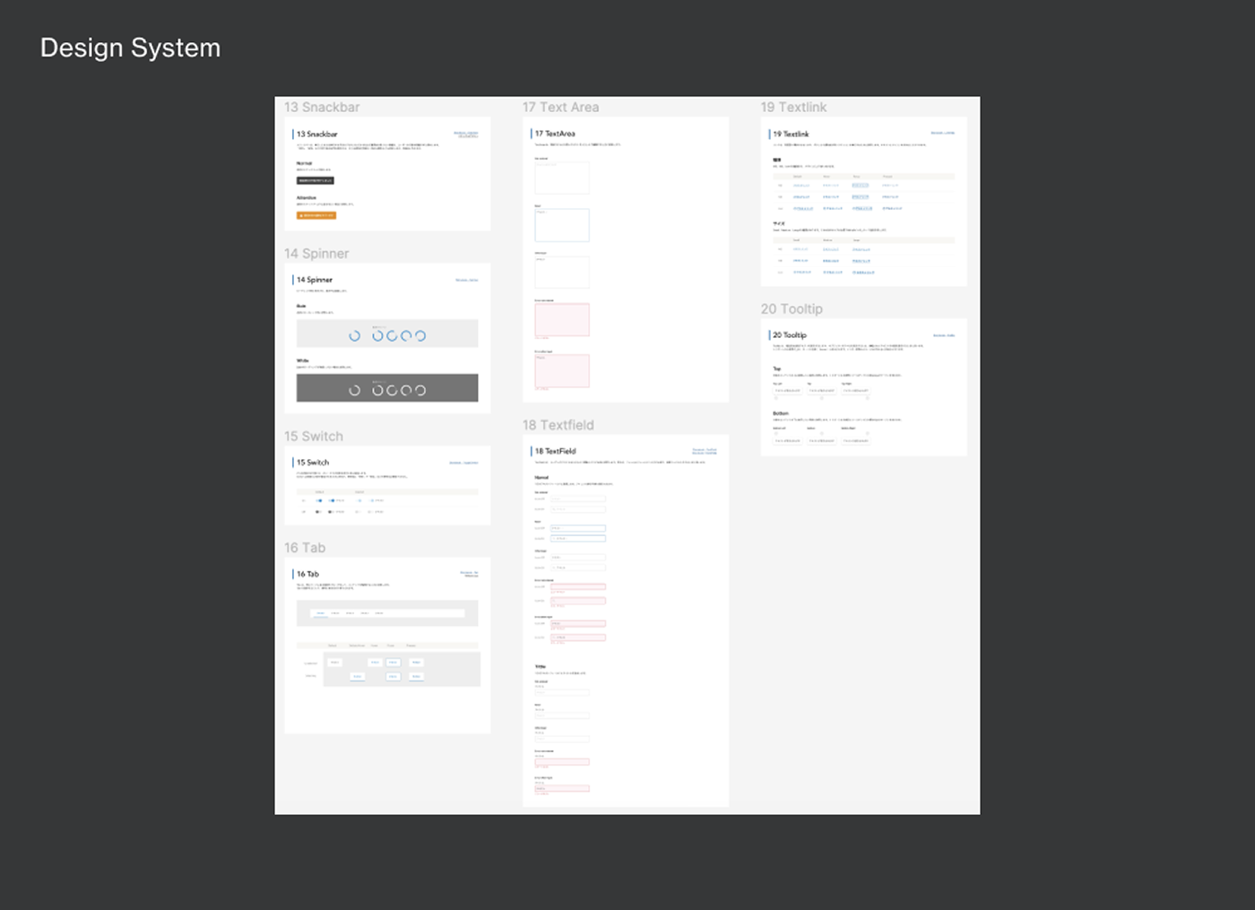
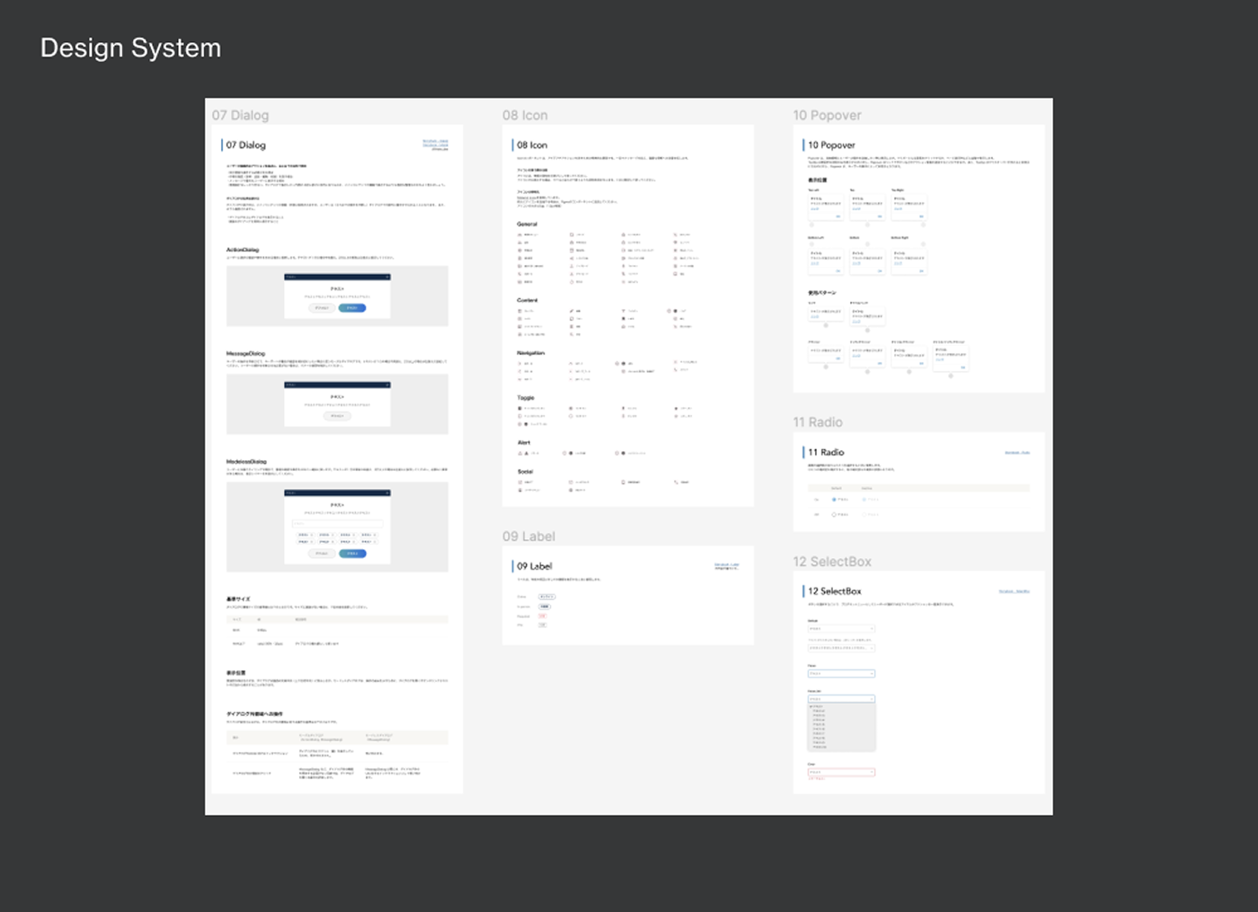
Design System
In building the design system, I paid particular attention to the following areas:
Color ContrastColors were carefully selected to meet WCAG contrast ratio requirements throughout.
IconographyEmphasis was placed on designing icons that are immediately understandable to the widest possible range of users.
Layout and TypographyLayouts were designed to be intuitively scannable, with typography chosen for high readability and appropriate letter spacing.
Understanding Interfaces for Older AdultsI facilitated a workshop on the cognitive and perceptual characteristics relevant to interface design, deepening the team's knowledge of how to design UI that genuinely serves the needs of older users.