
Brand Architecture and Identity Design for LocoStep
LocoStep is a medical AI app that analyzes gait function based on patients' walking videos. This project began as a request to create a logo, but as discussions progressed, we determined that it was necessary to restructure the relationships between the parent company, corporate entity, and product — and to launch LocoStep in a form that could withstand future sister brand expansion. This project covered everything from redefining the brand architecture to logo and VI design, through to establishing a minimal operational style guide.
Role
Duration
Team
Scope
Background & Challenges
When preparing to launch LocoStep, the first thing that became clear was that simply creating a product logo would not solve the underlying challenges.
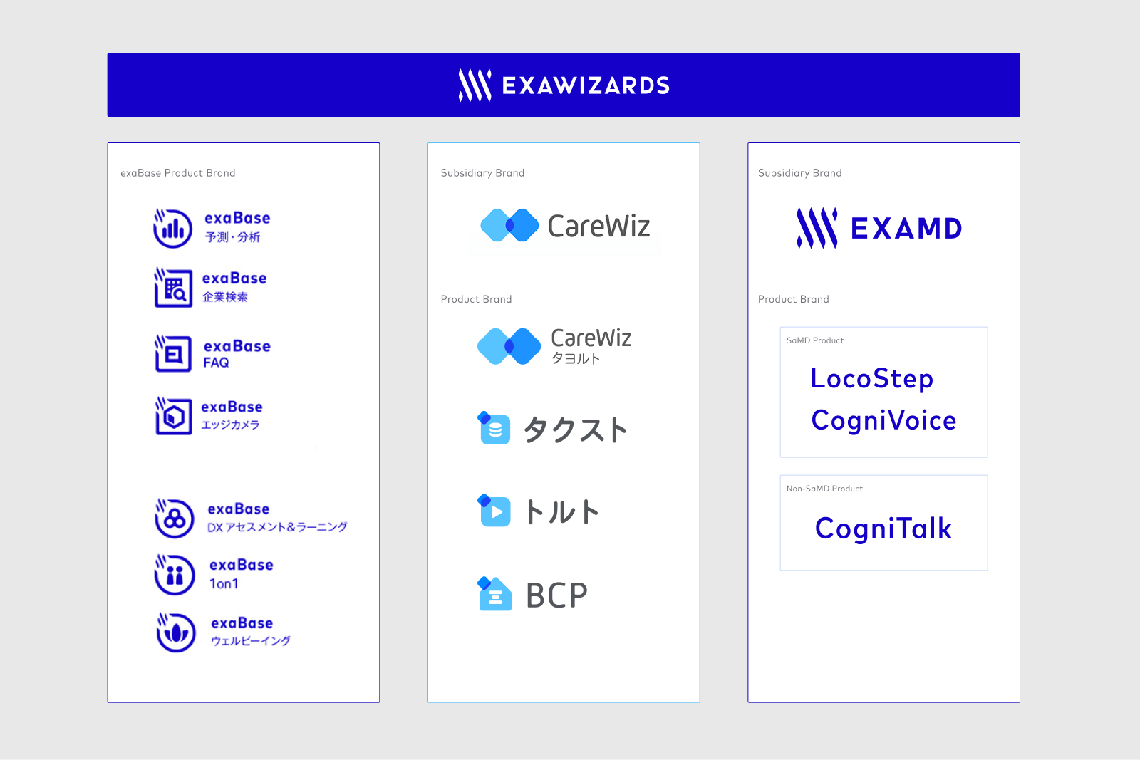
ExaMD had multiple businesses and products, and the relationship between the corporate brand and each product brand was not always clear to external audiences. It was also necessary to clarify the relationship with the parent company, ExaWizards, which had already established significant brand recognition.
In launching LocoStep, we first needed to address: "How should ExaMD as a company be perceived?" and "What role should LocoStep play within that structure?"
In addition, because LocoStep is a medical AI product, it needed to project not only innovation, but also the reliability and composure required for acceptance in clinical settings. The brand also needed to function across multiple touchpoints — not just within the app, but across web, sales materials, print, and future sister brand launches.
The core challenges of this project were:
1. Creating a distinct identity for ExaMD and LocoStep while leveraging the parent company's existing brand equity
2. Balancing the innovation expected of a medical AI product with the trustworthiness required in clinical environments
3. Building a brand foundation capable of supporting future expansion and ongoing operations

The scope of this project, therefore, was not simply to design the LocoStep logo — it was to redefine the brand positioning of ExaMD and LocoStep in light of their relationship with the parent company.
Approach & My Role
In this project, my responsibility spanned the full arc from structural organization — the foundation underlying the brand — through to establishing a minimal, operationally viable set of guidelines. This went well beyond simply creating the LocoStep logo and visual identity.
Approach
ロゴ制作を開始する前に、まず親会社やグループ全体のブランド構造を整理から始めました。
・Exploring what makes ExaMD distinctive as a medical-specific brand
・Proposing a color update to the ExaMD brand
・Established foundational rules for deployment across multiple touchpoints
My Role
- Organizing the corporate and product brand architecture within ExaMD
- Proposing a redefinition of the corporate brand informed by the relationship with the parent company
- Designing the logo and visual identity for LocoStep
- Establishing foundational rules for multi-touchpoint deployment
- Developing a minimal style guideBuilding consensus with executive leadership
- Creating an operational foundation ready for handoff to external designers
Brand Architecture
This project covered not only the creation of LocoStep's logo and visual identity, but the full process from structural organization to establishing a minimal, operational set of rules.
Structural Organization and ExaMD's Distinct Identity
I began by mapping out the structure of the parent company and the broader group — examining how the parent company, subsidiaries, and individual products should be perceived in relation to one another. From there, I defined a direction to reposition ExaMD as a brand with stronger medical affinity, while preserving continuity with the parent company.
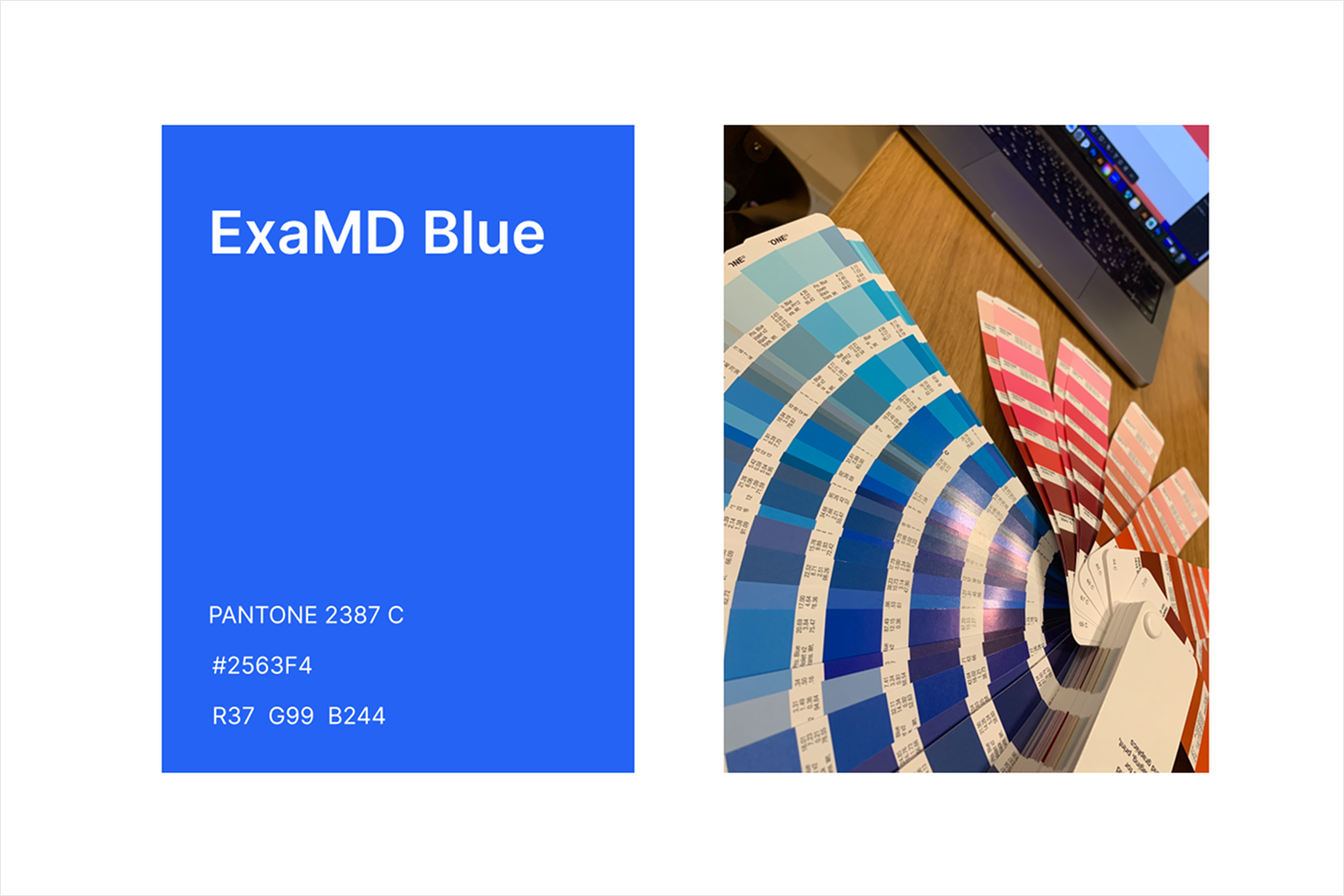
Brand Color Proposal : ExaMD Blue
At the time, ExaMD was following the parent company ExaWizards' purple-leaning Exa Blue. However, with the launch of LocoStep as the catalyst, I felt it was necessary to maintain continuity as an AI company while more clearly establishing the trust and credibility expected of a medical-specific brand.
My proposal was to change only the color from the parent company — retaining its established brand equity — and redefine a blue with stronger affinity to the medical domain as ExaMD's key brand color. By establishing this as the overarching brand color for all of ExaMD, I created a structure in which not only LocoStep, but future sister brands could also be developed with consistent visual continuity.
Design Process
Before entering visual exploration, I defined five design requirements for the LocoStep product logo. This created a framework for evaluating and discussing proposals against objective criteria.
Logo Design Requirements:
Intuitiveness
Trustworthiness
Brand Continuity
Scalability
Versatility
Motif Exploration
In the exploration phase, I worked from keywords associated with the product:
Among these, the motif of a "footprint" emerged as the strongest choice — directly connected to the product name LocoStep, and intuitively evoking gait analysis. However, rather than simply reducing a footprint to a symbol, the design also needed to convey the composure appropriate for a medical product and establish continuity within the ExaMD product family. Multiple directions were therefore explored in parallel, comparing not only visual impression but also long-term operational viability and scalability.
Comparing and Evaluating 3 Directions
In selecting the final direction, three candidate proposals were evaluated against the five design requirements. The priority was not just the completeness of LocoStep as a standalone mark, but whether it could hold up as part of the ExaMD product family over time.
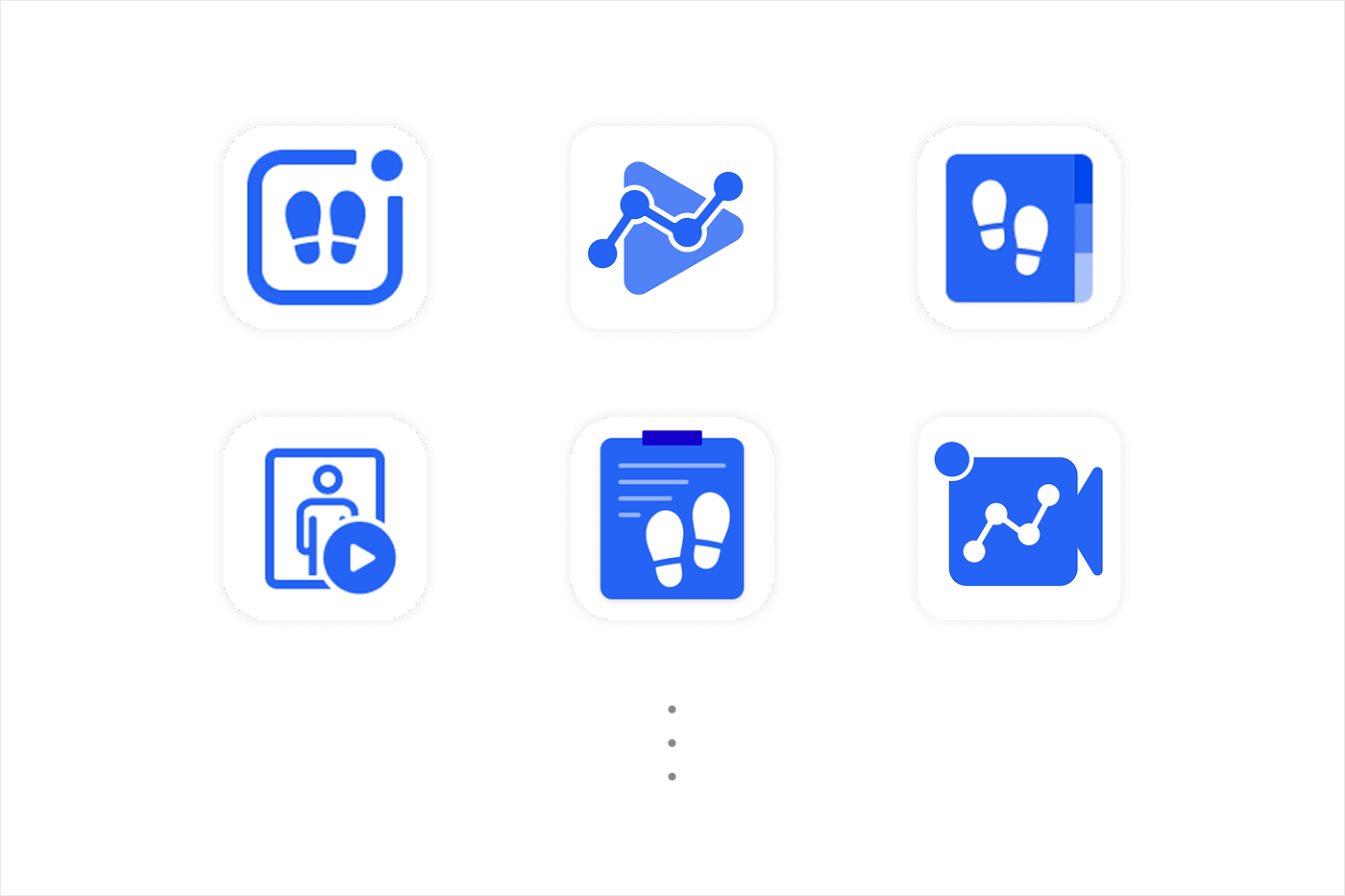
Option A: Footprint + Paper Medical Chart
Strong intuitive gait reference and medical credibility, but slightly complex with challenges around scalability.
Option B: Footprint + Medical Questionnaire
Strong narrative connection to medical process, but visibility challenges requiring adjustments for print and other use cases.
Option C: Footprint + Enclosing Frame
The best balance of continuity with the parent brand ExaBase, versatility, and scalability. The most viable option for future sister brand expansion.
Decision
Ultimately, Option C was selected for its superiority across the three axes of brand continuity, scalability, and versatility — a decision informed by the consideration that the ExaMD product lineup needed to function as a cohesive brand family when presented together in the future.
Validation
Multiple variations derived from Option C were created and validated in conditions approximating real-world usage — including testing resilience across different backgrounds and ensuring consistency with sister brands.
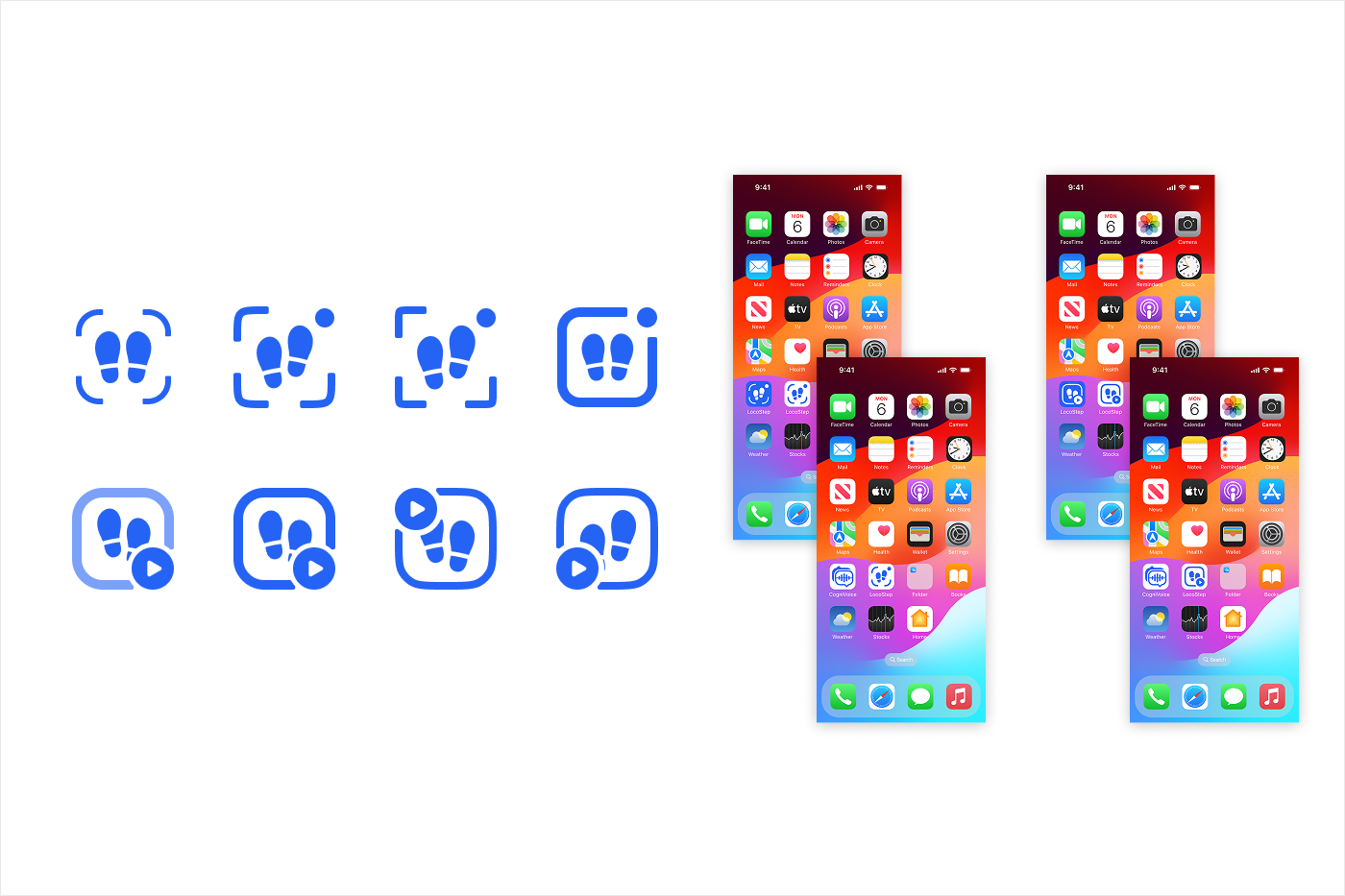
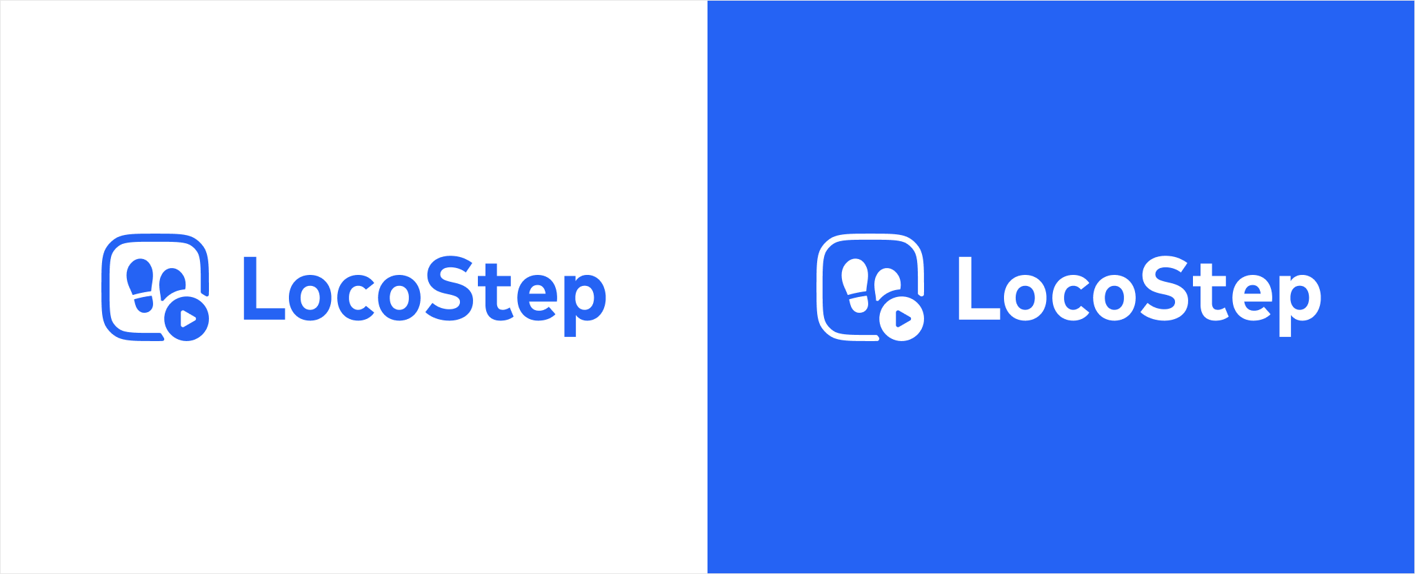
Final Logo and Meta-Rules for Brand Deployment
After repeated refinements to the final LocoStep logo, the team reached a final decision.
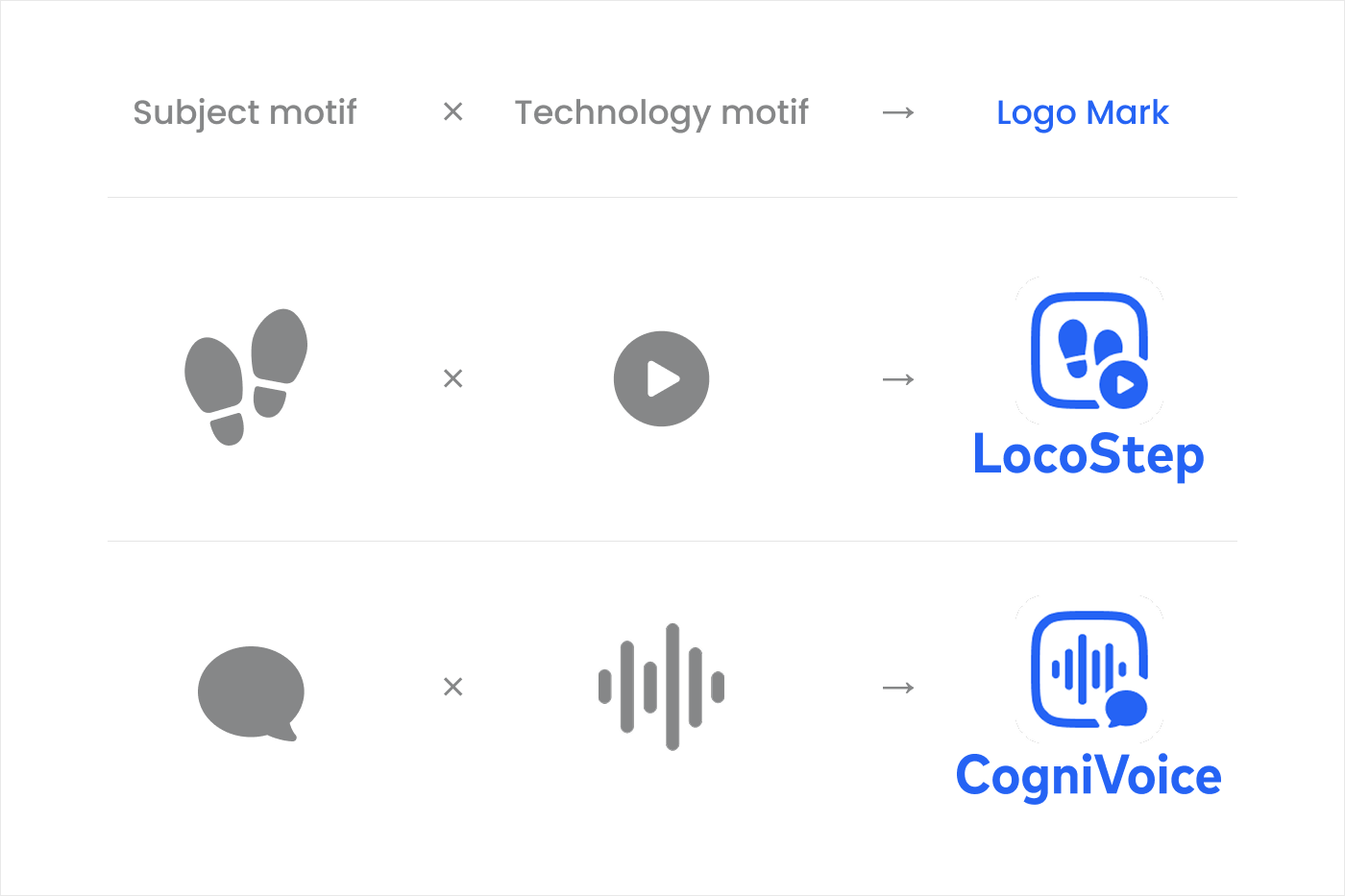
The "Subject of Analysis × Technical Modality" Meta-Rule
In the process of exploring sister product brands in parallel, I articulated a logo generation rule for establishing visual family coherence across sister brands: "Subject of Analysis × Technical Modality."
Rather than stopping at the creation of a single logo for LocoStep, this project succeeded in defining a design principle applicable to the entire ExaMD product brand family — transforming logo creation from a one-off task into a reproducible brand design process. This was one of the most significant outcomes of the project.
Output
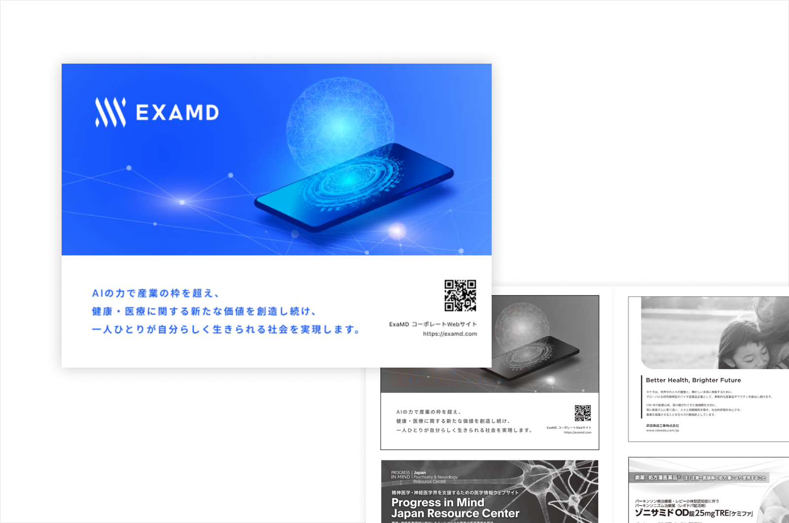
Deployment Across Multiple Touchpoints
The identity system was designed from the outset to function consistently across multiple touchpoints — not to exist as a logo in isolation.The system was validated across touchpoints with varying purposes and tonal requirements: app icons, landing pages, brochures, academic conference graphics, and advertising banners — testing whether brand continuity could be maintained throughout.

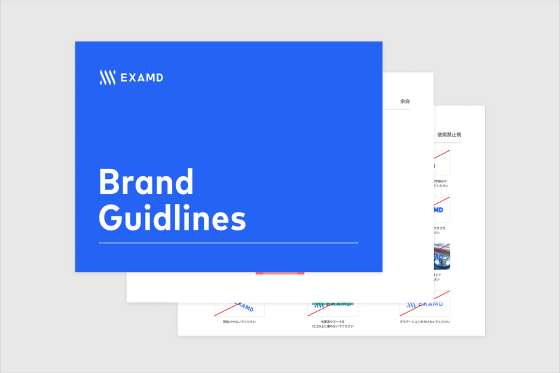
Minimal Style Guide
To support smooth early operations, a minimal set of guidelines was developed covering: color, typography, logo usage rules, do's and don'ts, and rules for presenting sister brands alongside one another.
Rather than aiming for a comprehensive brand guidelines document, keeping the guide to the minimum viable unit for early operations meant that consistency could be maintained without sacrificing speed. These guidelines were shared with external designers, video creators, and the sales team, and served as the foundation for all subsequent production work.
Outcomes & Learnings
Outcomes
1. Achieved a consistent brand launch across multiple touchpoints
Consistent brand expression was realized across touchpoints of varying nature, including app, web, academic conferences, sales materials, press releases, and brochures.
2. Established conditions for maintaining quality in external production
With a minimal style guide in place, it became possible to brief external designers and video creators in a way that kept brand tone reliably on track.
3. Defined a design principle for future sister brand expansion
Through the parallel exploration of LocoStep and future sister brands, a shared rule was articulated: each product logo combines a motif representing the subject of analysis with a motif representing the technical modality. This rule made it possible to define a design principle applicable across the entire ExaMD product brand family — going well beyond the creation of a single logo.
Learning
1. Branding is the work of designing corporate value
Logo and VI design is not a question of aesthetics. It is a question of corporate value: how the relationship between corporate and product is communicated, and how it is sustained over time.
2. The ability to make long-term design decisions within short-term constraints is critical
Rather than striving for a perfect set of guidelines, launching with the minimum viable unit and building incrementally while in motion ultimately creates a stronger brand foundation.