UX/UI Design for a native app renewal for a B2B software company in the tourism industry
I led UX/UI design for the native app redesign of Zaui, a Vancouver-based B2B software company serving the tourism industry. The app is used by tour operators and travel agency staff to book tours and products on behalf of their customers.
Unlike typical consumer-facing travel booking sites or e-commerce platforms, this app is built around a specialized use case: booking multiple products for multiple customers simultaneously. The core challenge was to design an experience that made both new bookings and modifications to existing reservations seamless — while also ensuring intuitive navigation between products, a clear path from product selection to checkout, and visual consistency with the company's corporate website.
役割
期間
チーム
内容
Challenges and Approach
In the existing app, the primary workflows — booking, modifying reservations, and searching — lacked clear information hierarchy, making it difficult for users to find what they needed. Screen layouts and information architecture were inconsistent across the app.
This was especially problematic in a B2B tourism context, where users manage multiple products and conditions simultaneously. Users frequently lost track of where they were in a flow and what to do next, resulting in a high cognitive load.
Rather than treating this as a visual refresh, I approached the project as a full restructure of the core task flows — redesigning the architecture so users could move through their work intuitively on mobile. This involved rethinking information priority, defining the purpose of each screen, improving input and selection interactions, refining filter presentation, and establishing a consistent native app UI and interaction pattern throughout.
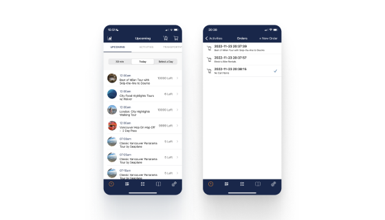
More Intuitive Multi-Customer Booking Management
Smoother switching between new and existing reservations
In the existing design, the workflow for creating new bookings and modifying existing ones was difficult to follow. It was hard to tell at a glance which customer's reservation was currently on screen. The icon used for this function also closely resembled the shopping cart icon and was placed adjacent to it, making the two easy to confuse.
The existing design lacked a clear visual structure for "switching between reservations across multiple customers," and the icons used were either ambiguous in meaning or too similar to icons used for other functions.
To make multi-customer booking management more intuitive, I drew inspiration from Slack — a globally familiar app known for its seamless workspace-switching experience. The currently active customer is always visible on screen, allowing staff to confirm at a glance whose reservation they're working on, helping to prevent booking errors. The icon was redesigned to clearly convey the concept of "a booking list per customer."
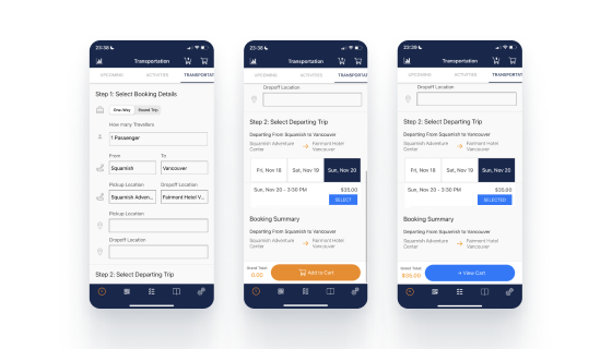
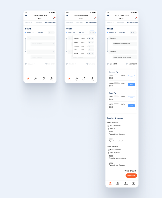
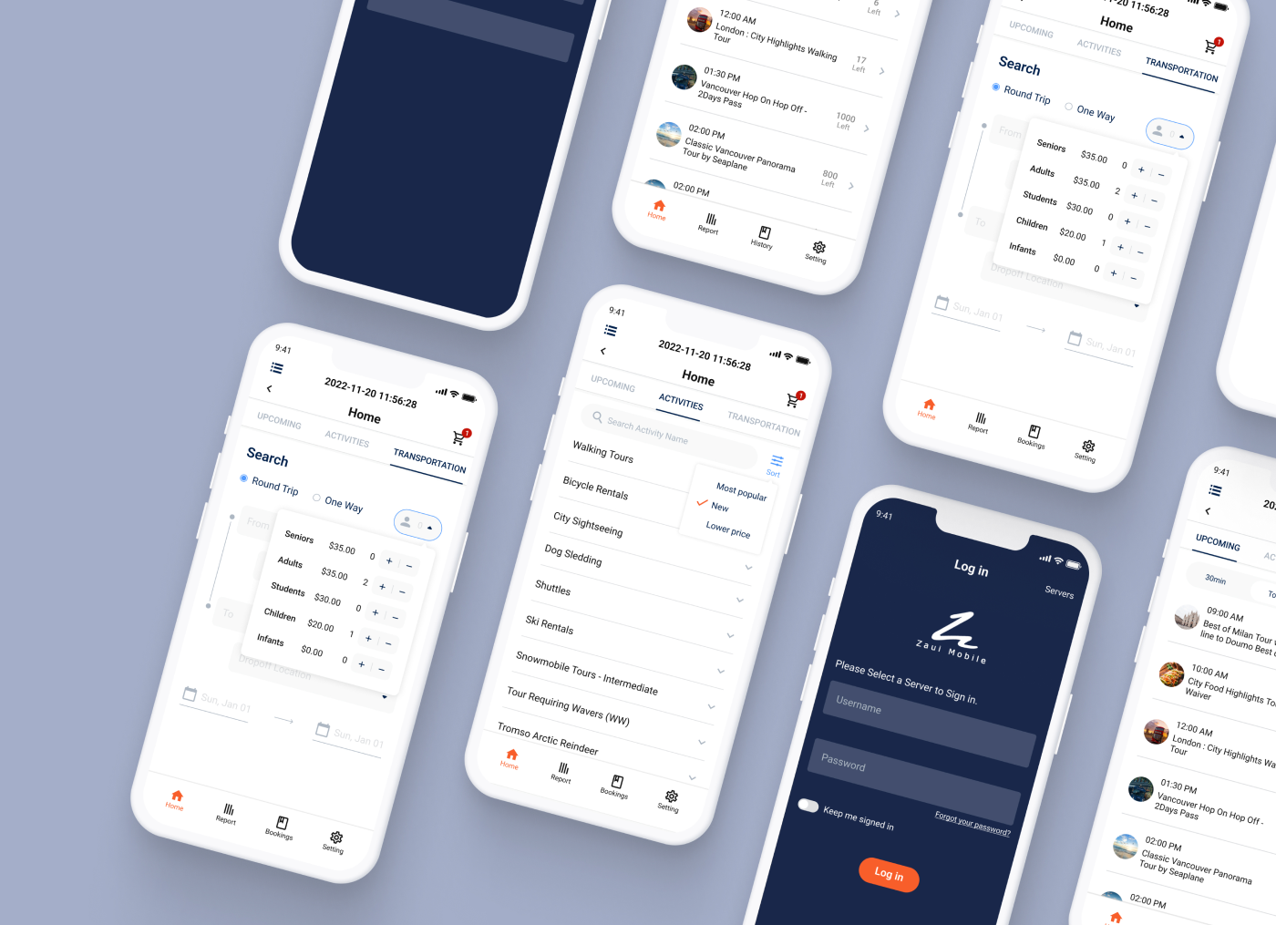
Simplified Search and Booking for Transportation
Redesigned search flow for buses and trains
In the existing design, the process of searching for and booking transportation such as buses and trains was overly complex. I redesigned the experience to simplify the input of date, time, passenger count, and stop information — creating a smoother flow from search through to product selection and booking confirmation.
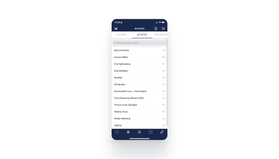
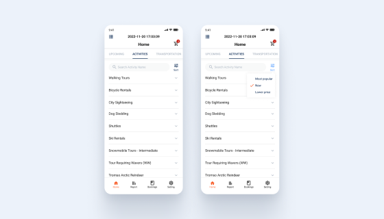
Helping Users Find the Right Product Faster
Improved product discoverability through sort functionality
By introducing sort functionality, I made it easier for users to quickly identify the product that best fits their needs.